LOGO DESIGN
Collection of logos. See below for descriptions.
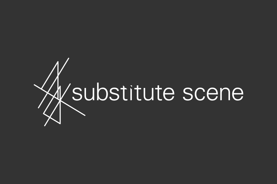
SUBSTITUTE SCENE RECORDS
Substitute Scene is a female / queer run record label based in Brooklyn, New York. This logo relies on basic symmetry, shape, and lines to express movement and the consistently changing direction and nature of music, while maintaining a clean aesthetic that’s associated with the genres it publishes (electro indie, shoegaze, and dream pop).
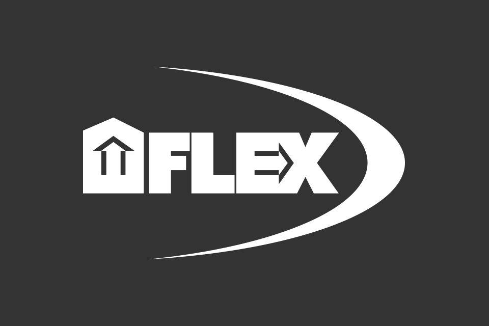
FLEX
IAPMO FLEX testing is an online proctored exam that allows students to securely and conveniently complete exams on personal computers from the privacy of their own homes or offices. The FLEX logo utilizes the “house/arrow” shape formed by the letters ‘E’ and ‘X’ to symbolize at-home online testing. An additional arrow, representing speed and a mouse cursor, reinforces the online nature of the exams, while a “swoop” element connects the logo to its parent company and visually represents flexibility.
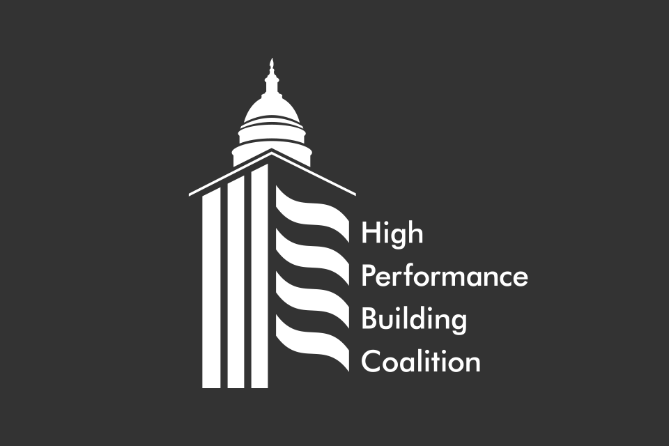
HIGH PERFORMANCE BUILDING COALITION
The High Performance Building Coalition comprises approximately 200 organizations, legislators, and U.S. Representatives. They support legislation and policies that protect life and property, promote innovative building technologies, and increase energy and water efficiency. After shortening their name from the High Performance Building Congressional Caucus Coalition, they came to me for an updated and simplified logo. This logo uses vertical lines to depict buildings and wavy lines to symbolize energy.
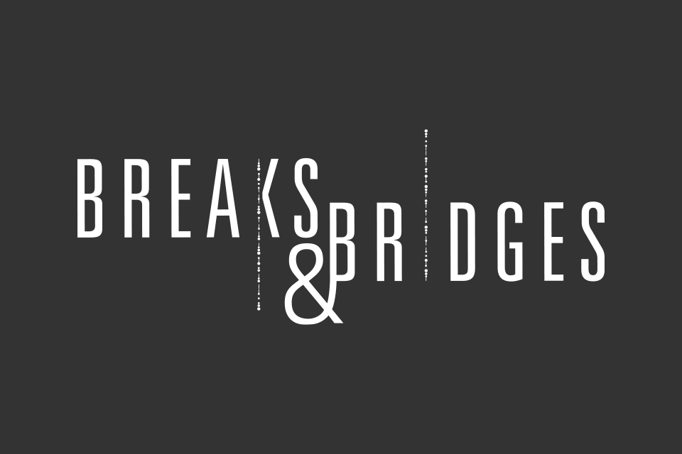
BREAKS & BRIDGES
Breaks and Bridges was a Chicago-based indie/progressive rock band. They were loud and gritty, but they also had many clean, peaceful moments in their songs that gave an atmospheric feel. Because their songs have many rapid changes in tempo and dynamics, I kept thinking of Morse code when I listened. Morse code is calculated and systematic, but it can also seem irregular and chaotic; I thought this represented the band perfectly. The dots and dashes of Morse code can also represent literal breaks and bridges. To get the clean/atmospheric feel that I needed, I used a condensed sans-serif type. To get the gritty/textured feel I needed, I replaced the “i” and the stem of the “k” with lines constructed with dots and dashes, which spell “Breaks and Bridges” in Morse code.
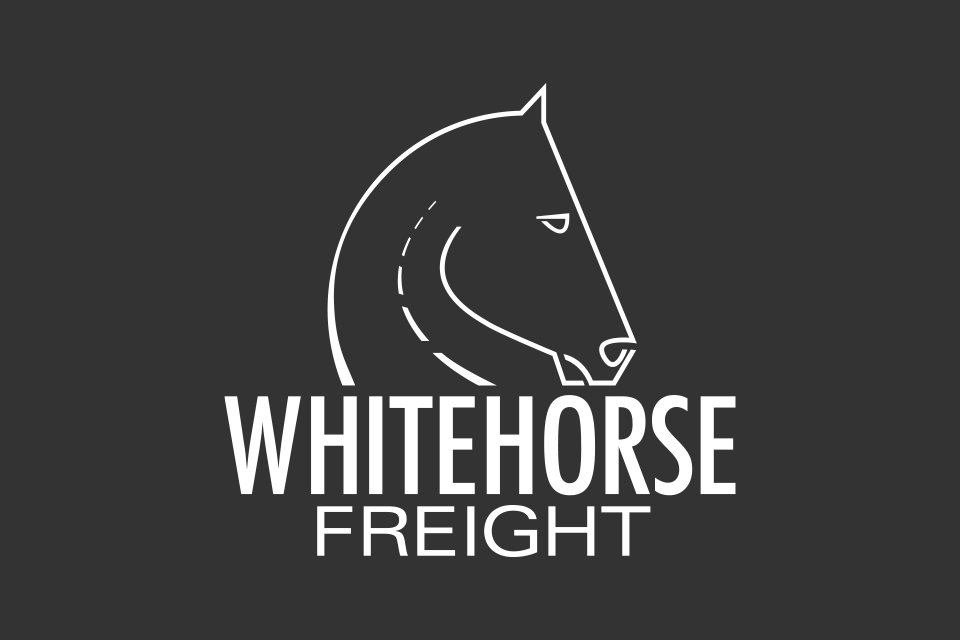
WHITEHORSE FREIGHT
Whitehorse Freight is a third-party logistics/freight brokerage company based in Cincinnati, Ohio. To illustrate the company’s hard working, honest, and dependable character, the horse in the logo was illustrated with a confident/stern expression and strong, sharp edges. A curved road was incorporated into the illustration to allude to the transportation and logistics focus of the business.
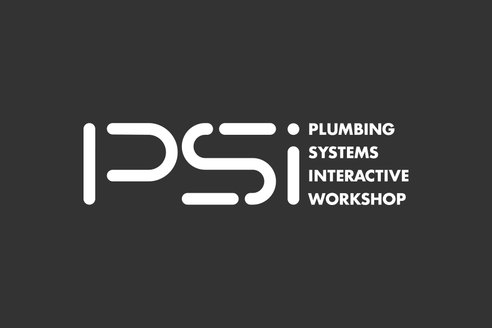
PLUMBING SYSTEMS INTERACTIVE (PSI) WORKSHOP
Plumbing Systems Interactive Workshop is a fun, interactive, and tactile course that covers the effective uses of four basic plumbing systems, and includes hands-on assembly of each system type using scaled, 3D-printed drainage pattern fittings. The idea for this logo was to highlight the interactive and 3D-printed aspects of the course — the curved “u” shapes represent the 3D-fittings, and the spacing between them shows that they are disconnected and can be put together.
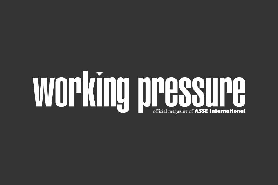
WORKING PRESSURE MAGAZINE
Working Pressure is a quarterly trade magazine distributed to more than 22,000 readers in the plumbing and mechanical industry. This logo uses “ultra compressed” type to illustrate pressure, and the inverted triangle used to dot the “I” is a reference to a symbol commonly used to indicate pressure in piping diagrams.
MAYA MUEBLE
Maya Mueble is a retailer of handcrafted furniture and textiles from Central America. This logo was designed with the high-end retail market in mind – simple and clean. The angular nature of the type, and type placement, are a nod to many of the company’s textile and furniture designs.
THE AUTHORITY PODCAST
The Authority Podcast is a semi-monthly podcast from The IAPMO Group. Each episode discusses the latest trends in plumbing and mechanical safety, sustainability, and resiliency. This logo uses a weathered circle/seal/stamp motif, echoing the approvals and endorsements typical in the plumbing and mechanical sectors. This design choice resonates with the podcast’s target audience of engineers, building officials, and policy-making authorities.
ASSE EVALUATION SERVICES
ASSE Evaluation Services (ES) creates evaluation reports that cover where and how water related products should be installed, how it complies with specific standards and model codes, and what its limitations are. The service then assists companies that are looking for better acceptance in the marketplace by way of a recognized 3rd-party certification and mark, which may be stamped on products or used in product literature. Since this service and mark fall under the umbrella of ASSE International, the mark needed to fit within a larger collection of certification marks, including those developed for product and personnel certification, but be different enough to not create confusion. The resulting mark uses the “ASSE” lettering found in the organization 100-plus year old logo, along with new “ES” letterforms created based on the existing type. The “ES” type was placed in a square to separate the mark from the organization’s other certification marks while also tying everything together with geometry (circle, rectangle, and square).