Working Pressure, official magazine of ASSE International, is a quarterly publication reaching over 22,000 members in diverse fields including backflow prevention, plumbing, water quality, HVAC, fire protection, and more. In 2018, ASSE’s magazine faced the challenge of having become disconnected from its core audience. ASSE International recognized the need for a comprehensive rebranding to re-engage its readership and ensure the magazine’s content remained relevant and appealing.
Research and Planning: The revitalization began with research and surveys to gauge the demographics, interests, and preferences of current readers. This process also included interviews with ASSE International staff to align the magazine’s direction with the organization’s vision. Key steps involved selecting a new name, planning regular content, scheduling deadlines, and establishing advertising specifications and rates.
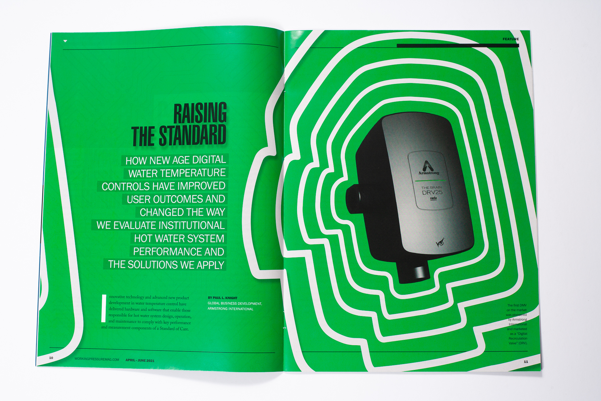
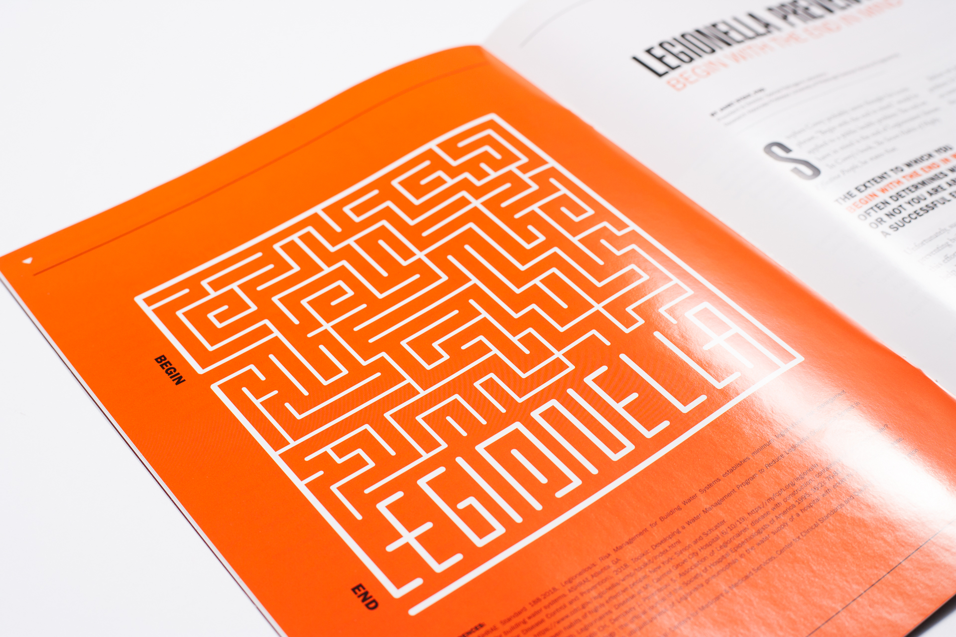
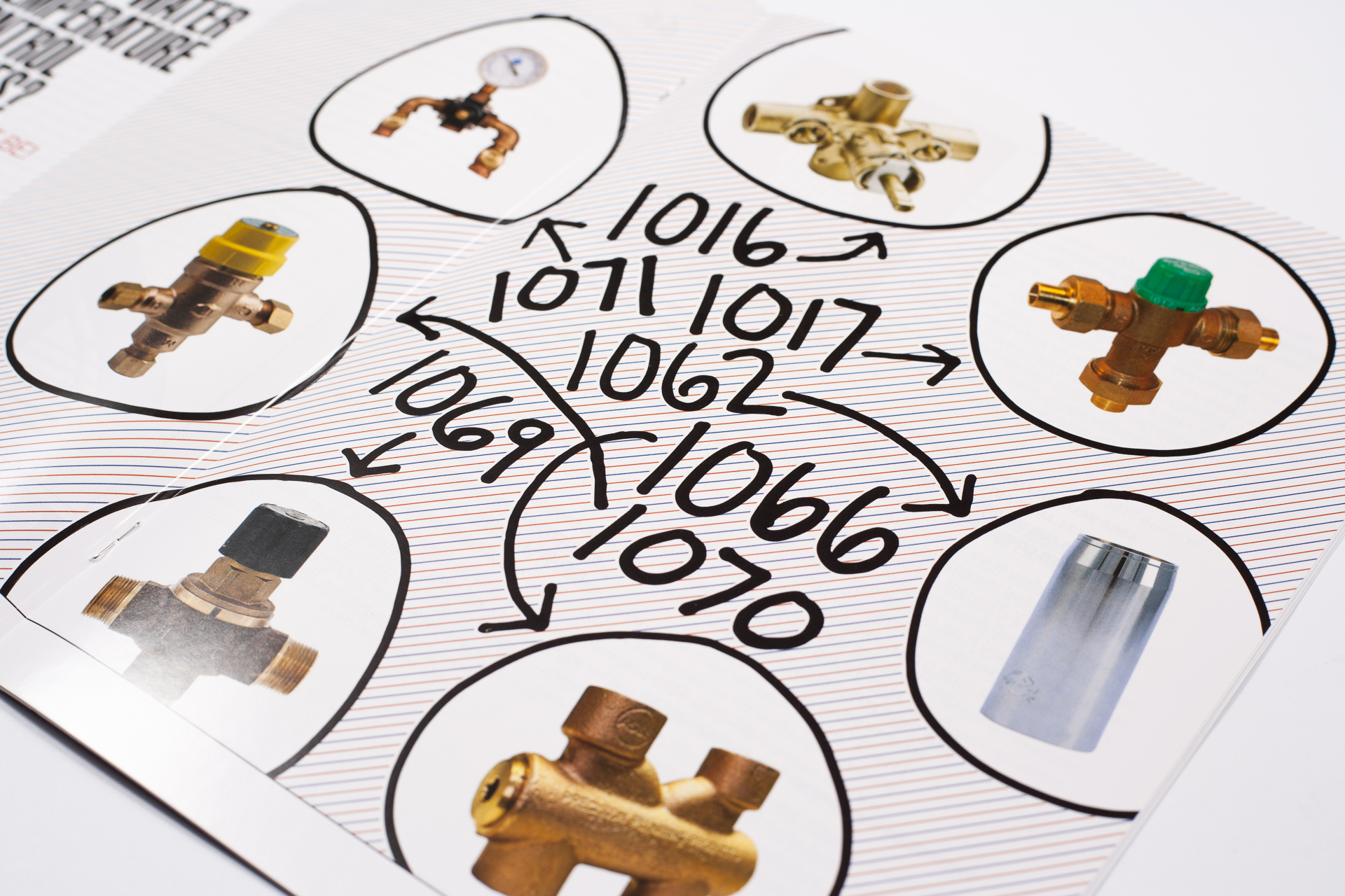
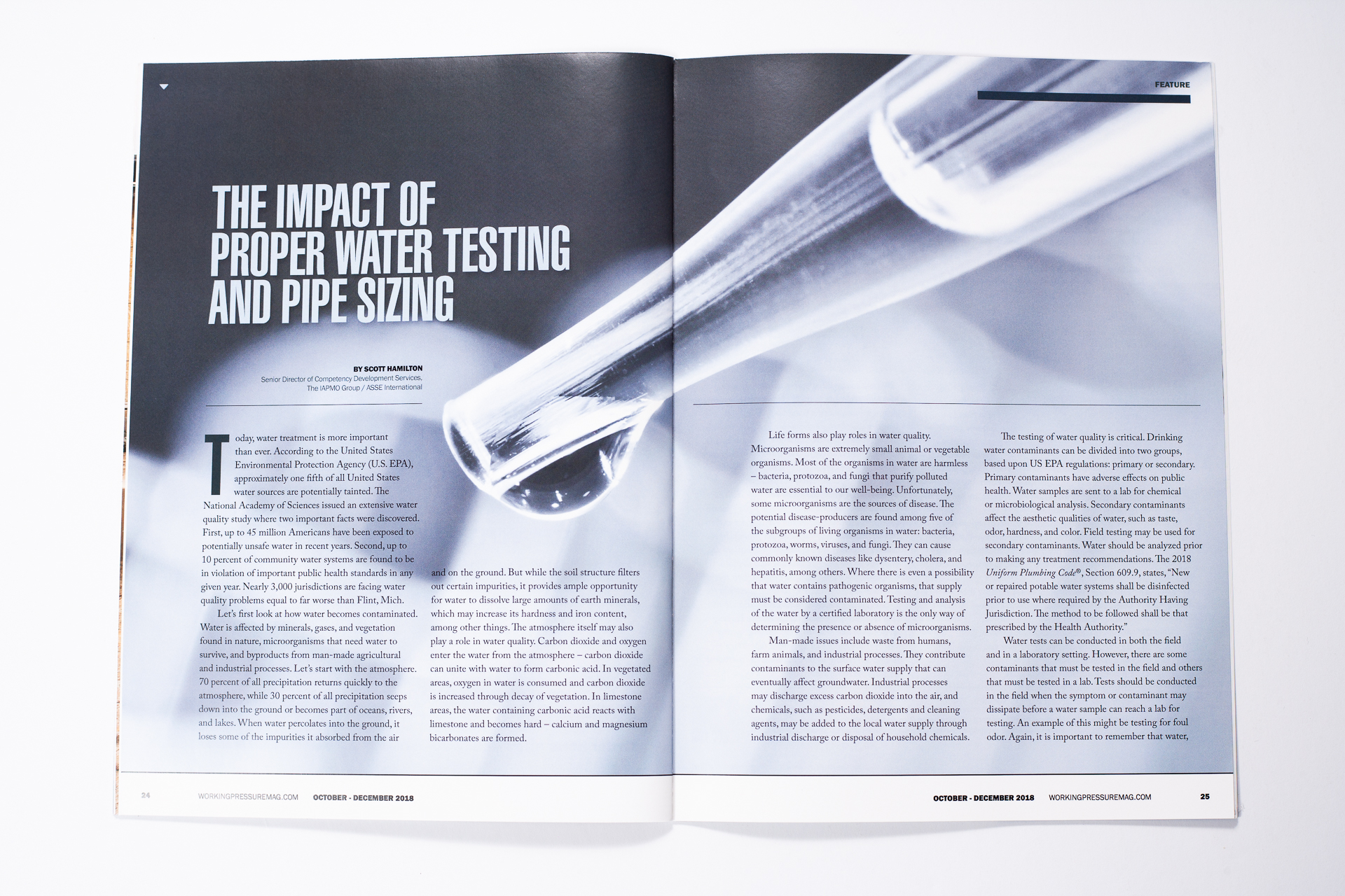
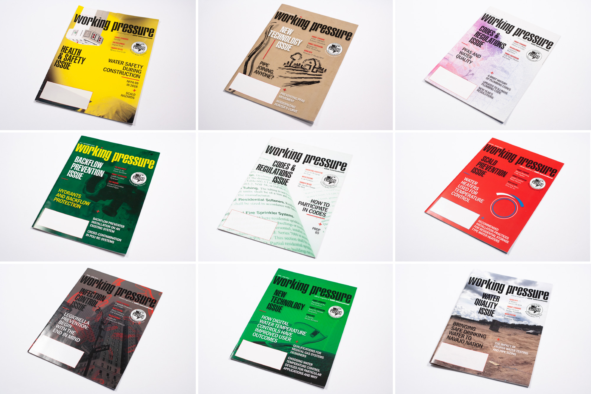
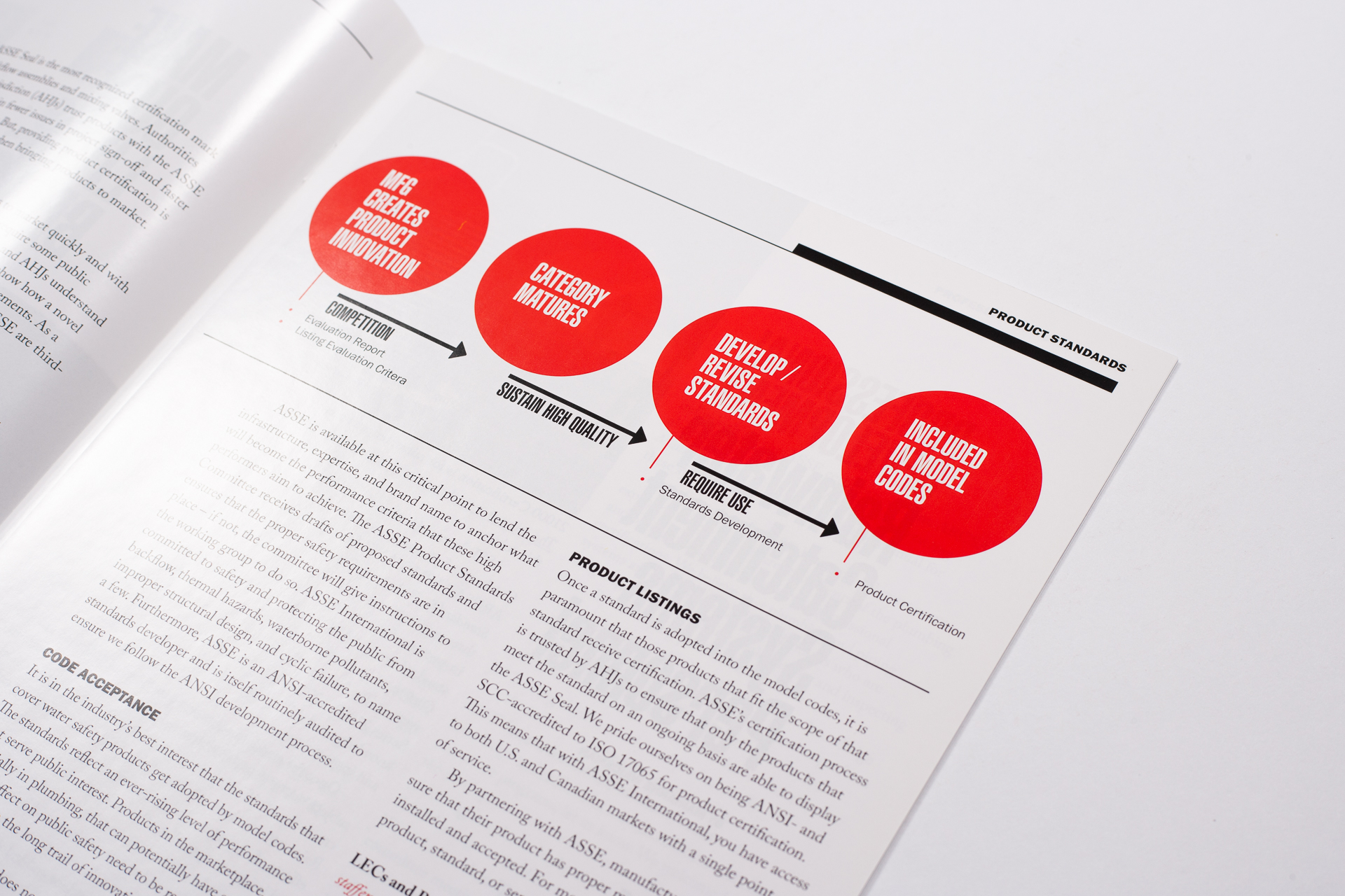
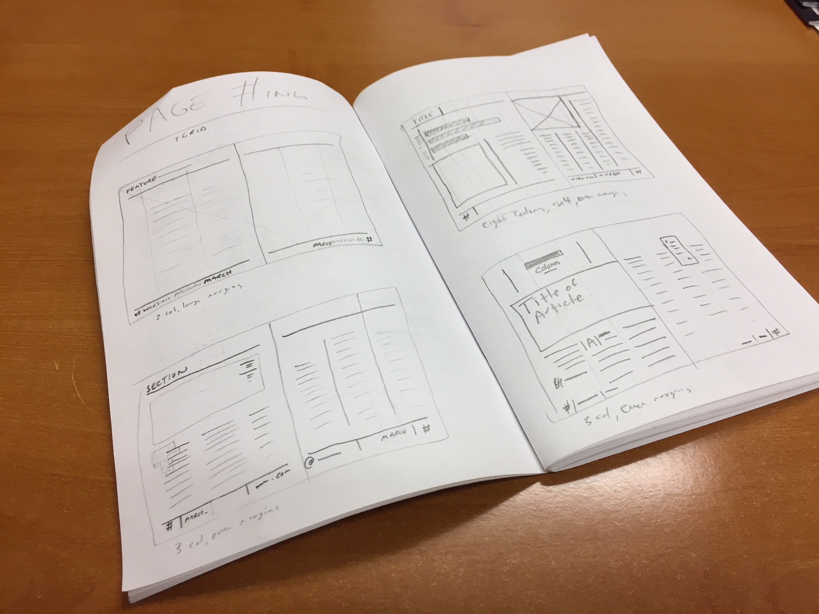
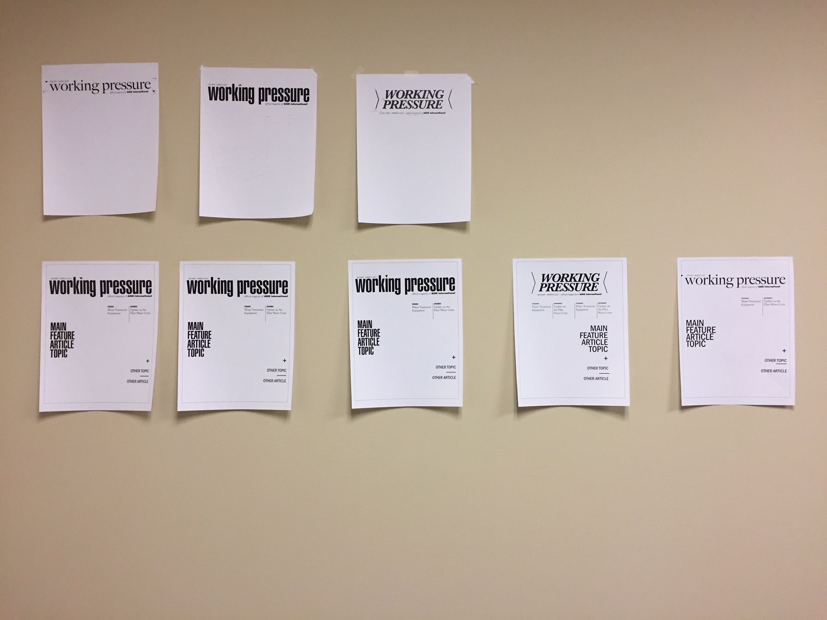
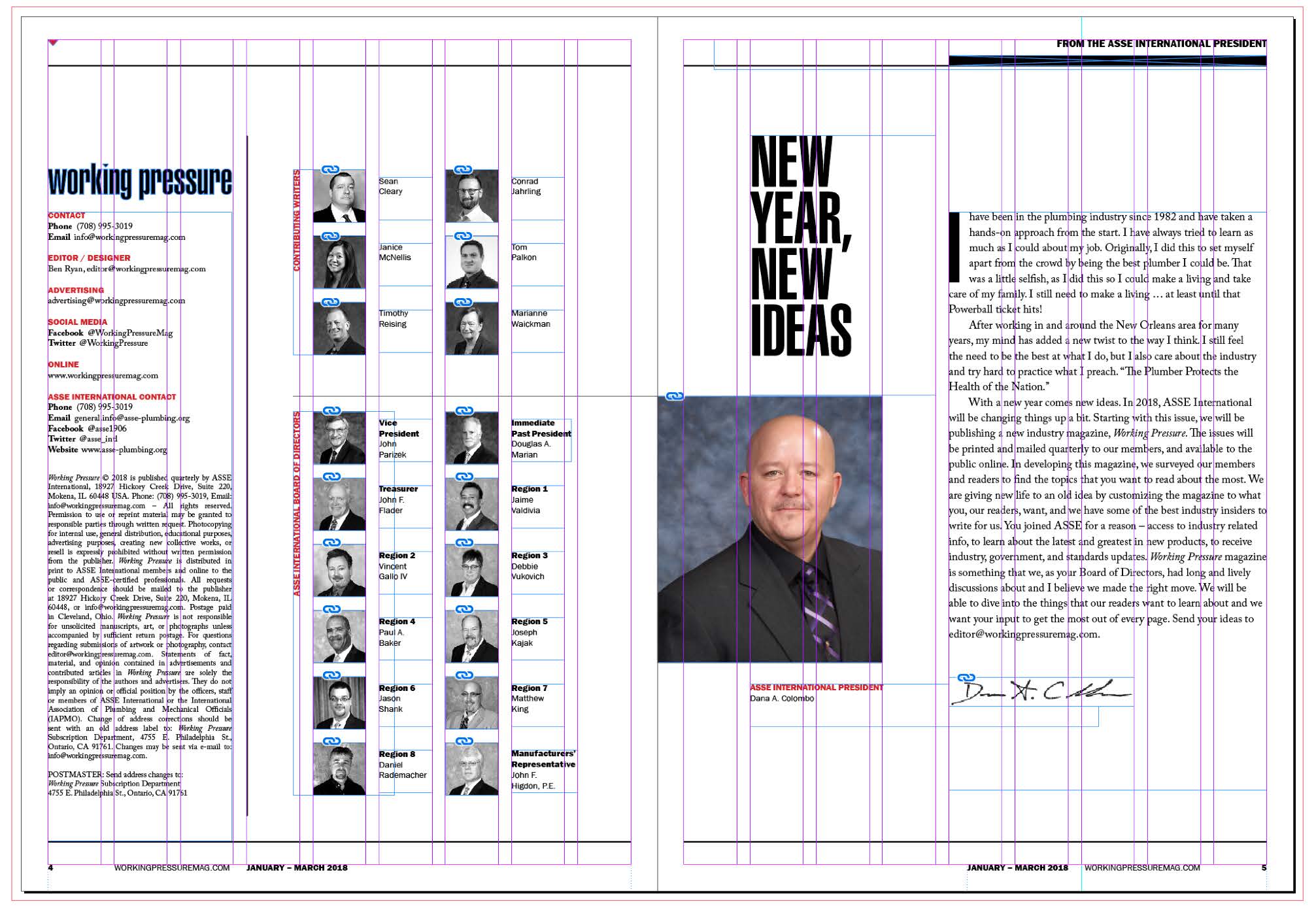
Identity Development: With a clear understanding of the audience and objectives, the focus shifted to developing a visual identity. This phase included creating mood boards, designing a new logo / masthead, choosing font families and color schemes, and establishing a grid system for layout consistency. The logo design features ultra-compressed typography to symbolize pressure, while an inverted triangle in the “I” references a common symbol representing pressure in piping diagrams. The flexible yet structured grid system allows for creativity in art direction and layout while maintaining consistency across issues.
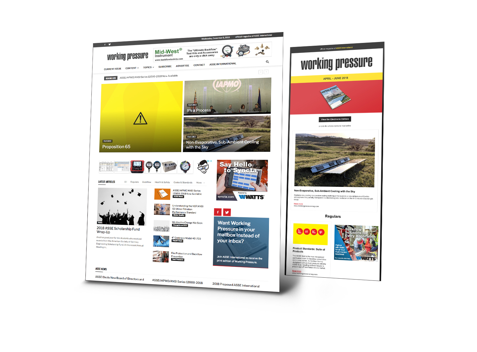
Digital Presence: A complementary website was developed, adopting a news/blog style to digitally house the magazine’s content. This ensured accessibility and extended reach beyond the print readership.